


Summary
Two new features in the network path performance dashboard allow users to see the network latency evolving over time and split the corresponding values directly in the time series. Distribution is a new feature that allows users to quickly understand and troubleshoot network latency values, filter out and get more detailed information, and focus on a specific test.
Transcript
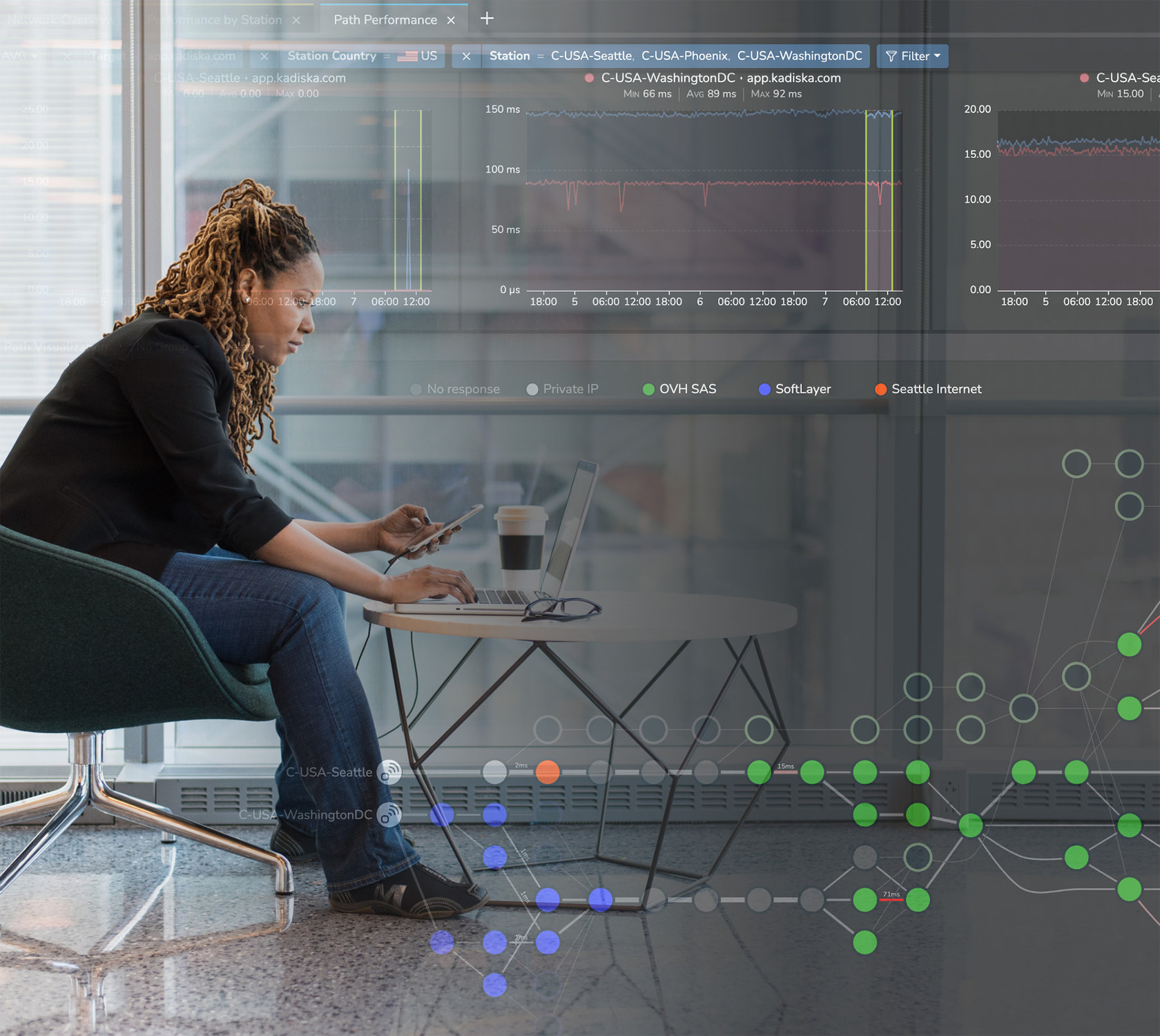
In the short video, I will show you how to use the two new features we have introduced in the network path performance dashboard. And for that, I will use the example of our Kadiska CASB service. So here on the map, I’m focusing on this CASB service so that I can see how this service is reachable from all the testers I have considered.
From the table below, we can see that the network and latency are constantly changing when users connect from Germany. So this is a behaviour I do want to understand, and for that I have to simply select the tester and then navigate to the past performance dashboard.
On this time series, you can see how the network latency is evolving over time and the big move between five milliseconds and 20 milliseconds. In the past, I had to try to use the focus mode to select a peak and see how the network passed visualisations to understand this type of
In this case, this is not so easy because the network latency is constantly moving. So this is why we have introduced two new features.
The first one is having the option to see the time series by target IP address. So when the tester, during the DNS resolution process, ends up targeting different destination IPs, this is what I see here on the network path. In fact, I can split the corresponding values directly in the time series now with this new feature. So, when I choose Target IP, I can see that I do end up targeting two different IP addresses, and one of them seems to be closer to the user.
The second feature we have introduced is a new type of widget, which is the distribution. You can see here that only NetTrace ends up with a high network latency value. In my case, those tests ended up with a roundtrip time that was between 20 and 22 milliseconds.
So, to understand the corresponding network path, I simply select as I normally do with the focus mode. I simply select a peak of RTT directly from the distribution graph so that the network path will be automatically updated accordingly. So here, I understand that when I have a high latency value, then this is the network path that is taken.
So I’m going through Lumen Technologies, for example. And when everything is fine, I select another one so that I can understand that in this case, I’m not going to Lumen Technologies. I’m going from Hetzner Online to Peering LAN before reaching the CASB node. What I can In addition to that, when I select a specific part of the spectrum, I can still use the focus mode to focus on a specific peak if I want to.
So in this case, you see a peak of 22 milliseconds. If I still want to understand what happened during this specific timeframe, I can combine these two filters. So I now have a focus mode on the distribution graph, in addition to a focus mode in the time series graph, so that again, I can understand and quickly troubleshoot what happened.
And then, as usual, I can use this focus mode to filter out and get more detailed information, so that I can even focus on one specific test if I want to, by selecting this specific test in my case and seeing the corresponding network pattern.