Visual Stability: how to improve your Cumulative Layout Shift (CLS)
Google introduced Cumulative Layout Shift (CLS) in May 2020 as part of the Web Core Vitals. Let’s take a closer look at the definition of the CLS, how it measures the visual stability on your web platform and how to improve it.
What is Cumulative Layout Shift (CLS)?
Have you ever been reading an article on the web when something suddenly changes on the page? Without warning, the text moves, and you are lost. Or even worse: you’re about to tap a link or a button, but in the instant before your finger lands, the link moves and you end up clicking something else!
Cumulative Layout Shift (CLS) measures how ‘stable’ elements load onto the screen. It looks at how often these elements jump around while loading and by how much.
A layout shift occurs any time a visible element changes its position from one rendered frame to the next
How Cumulative Layout Shift (CLS) tracks the visual stability
In summary, CLS measures the sum of all individual layout shift scores for every unexpected layout shift that occurs during the entire lifespan of the page.
Getting into how it is calculated, CLS incorporates two different measures: the impact fraction (1) and the distance fraction (2).
CLS value = impact fraction x distance fraction
Impact fraction
First, the impact fraction measures how unstable elements impact the viewport area between two frames.
The union of the visible areas of all unstable elements for the previous frame and the current frame, as a fraction of the total area of the viewport, is the impact fraction for the current frame.
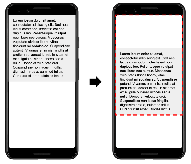
In the image above there’s an element that takes up half of the viewport in one frame. Then, in the next frame, the element shifts down by 25% of the viewport height. The red, dotted rectangle indicates the union of the element’s visible area in both frames, which, in this case, is 75% of the total viewport, so its impact fraction is 0.75.
Distance fraction
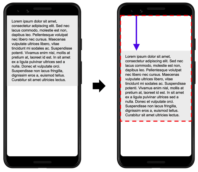
The other part of the layout shift score equation measures the distance that unstable elements have moved, relative to the viewport. The distance fraction is the greatest distance any unstable element has moved in the frame (either horizontally or vertically) divided by the viewport’s largest dimension (width or height, whichever is greater).
In the example above, the largest viewport dimension is the height, and the unstable element has moved by 25% of the viewport height, which makes the distance fraction 0.25.
So, in this example the impact fraction is 0.75 and the distance fraction is 0.25, so the layout shift score is 0.75 * 0.25 = 0.1875.
What is a good CLS score
To provide a good user experience, sites should strive to have CLS score of less than 0.1. Everything under 0.25 needs improvement and you can consider everything over that as performing poorly.
How to improve CLS
The most common causes of a poor CLS are:
- Images without dimensions
- Ads, embeds, and iframes without dimensions
- Dynamically injected content
- Web Fonts causing FOIT (Flash Of Invisible Text) / FOUT (Flash Of Unstyled Text)
- Actions waiting for a network response before updating DOM
For most websites, you can avoid all unexpected layout shifts by sticking to the following recommendations:
- Always include size attributes on your images and video elements. Alternatively, reserve the required space with something like CSS aspect ratio boxes
- Never insert content above existing content, except in response to a user interaction
- Prefer transform animations to animations of properties that trigger layout changes. Animate transitions in a way that provides context and continuity from state to state
As a follow up, we recommend that you take a look at the two other Web Core Vital metrics:


